
Creating a fun Flutter form validation animation in 15 minutes or less
In this short tutorial, we will create a NOPE form validation animation in Flutter. All you need is a basic understanding of Flutter and Dart. Let's get started!
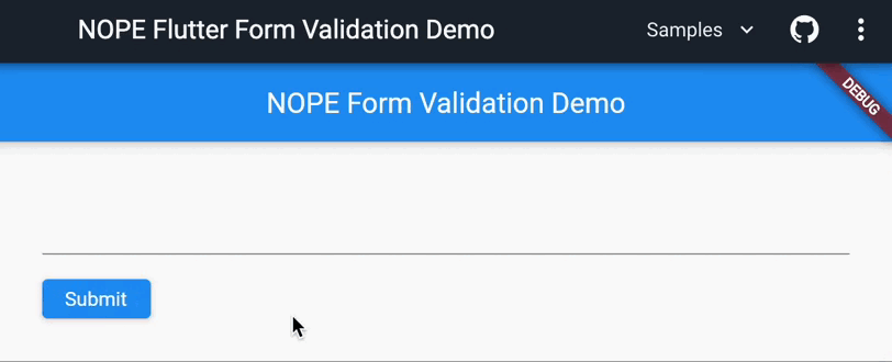
Initial code
Don't judge me but I am a lazy person. I just wanted to create a simple NOPE animation in Flutter and not think about the form UI and other related code. Thus, I went to the Build a form with validation page in Flutter documentation and copied the code from there:
import 'package:flutter/material.dart';
void main() => runApp(const MyApp());
class MyApp extends StatelessWidget {
const MyApp({super.key});
Widget build(BuildContext context) {
const appTitle = 'NOPE Form Validation Demo';
return MaterialApp(
title: appTitle,
home: Scaffold(
appBar: AppBar(
title: const Text(appTitle),
),
body: const Padding(
padding: EdgeInsets.all(32),
child: MyCustomForm(),
),
),
);
}
}
class MyCustomForm extends StatefulWidget {
const MyCustomForm({super.key});
MyCustomFormState createState() {
return MyCustomFormState();
}
}
class MyCustomFormState extends State<MyCustomForm> {
final _formKey = GlobalKey<FormState>();
Widget build(BuildContext context) {
return Form(
key: _formKey,
child: Column(
crossAxisAlignment: CrossAxisAlignment.start,
children: [
SizedBox(
height: 50,
child: TextFormField(
validator: (value) {
if (value == null || value.isEmpty) {
return 'Please enter some text';
}
return null;
},
),
),
Padding(
padding: const EdgeInsets.symmetric(vertical: 16.0),
child: ElevatedButton(
onPressed: () {
if (_formKey.currentState!.validate()) {
ScaffoldMessenger.of(context).showSnackBar(
const SnackBar(content: Text('Thank you!')),
);
}
},
child: const Text('Submit'),
),
),
],
),
);
}
}
Note that I removed all the code comments for brevity and refactored the code a bit:
- Updated the
appTitlevariable toNOPE Form Validation Demo; - Added some padding for the
MyCustomFormwidget; - Added a
SizedBoxwidget with a fixed height of 50 for theTextFormFieldwidget. It helps for theSubmitbutton not to move down when the error message is shown; - Updated the
SnackBarmessage toThank you!. Always be nice, it's free 😃.
Let's get to the fun part!
Adding the NOPE animation
Now that we have a basic form, let's add the NOPE animation. We need an animation controller to run the animation - let's create one:
<...>
class MyCustomFormState extends State<MyCustomForm> with SingleTickerProviderStateMixin {
late final AnimationController _controller;
void initState() {
super.initState();
_controller = AnimationController(
vsync: this,
duration: const Duration(milliseconds: 300),
);
}
void dispose() {
_controller.dispose();
super.dispose();
}
<...>
}
The SingleTickerProviderStateMixin is required to use the vsync parameter in the AnimationController constructor. The vsync parameter is used to bind the animation to the screen refresh cycle. It prevents the animation from consuming unnecessary resources when the app is in the background or not visible.
Next, we need to create an animation that will be used to animate the button. The easiest way I could think of is to use the AlignTransition widget to change the button position from left to right. AlignTransition accepts the alignment parameter which is an animation of type Animation<AlignmentGeometry> - perfect for our needs:
<...>
class MyCustomFormState extends State<MyCustomForm> with SingleTickerProviderStateMixin {
late final AnimationController _controller;
late final Animation<AlignmentGeometry> _animation;
void initState() {
super.initState();
_controller = AnimationController(
vsync: this,
duration: const Duration(milliseconds: 300),
);
_animation = AlignmentTween(
begin: Alignment.centerLeft,
end: Alignment.centerRight,
).animate(
CurvedAnimation(
parent: _controller,
curve: Curves.easeInOutCubic,
),
);
}
void dispose() {
_controller.dispose();
super.dispose();
}
Widget build(BuildContext context) {
return Form(
key: _formKey,
child: Column(
crossAxisAlignment: CrossAxisAlignment.start,
children: [
SizedBox(
height: 50,
child: TextFormField(
validator: (value) {
if (value == null || value.isEmpty) {
return 'Please enter some text';
}
return null;
},
),
),
AlignTransition(
alignment: _animation,
child: Padding(
padding: const EdgeInsets.symmetric(vertical: 16.0),
child: ElevatedButton(
onPressed: () {
if (_formKey.currentState!.validate()) {
ScaffoldMessenger.of(context).showSnackBar(
const SnackBar(content: Text('Thank you!')),
);
}
},
child: const Text('Submit'),
),
),
),
],
),
);
}
}
The animation is ready, but we need to trigger it somehow. We will implement the onHover effect next.
Adding the NOPE hover effect
The onHover effect is a simple event triggered when the mouse pointer hovers over the widget - in this case, the ElevatedButton widget.
Let's extract the _isValid getter, first (it will be used in the onHover event handler) and add the onHover event to the ElevatedButton widget:
class MyCustomFormState extends State<MyCustomForm> with SingleTickerProviderStateMixin {
late final AnimationController _controller;
late final Animation<AlignmentGeometry> _animation;
final _formKey = GlobalKey<FormState>();
void initState() {
super.initState();
_controller = AnimationController(
vsync: this,
duration: const Duration(milliseconds: 300),
);
_animation = AlignmentTween(
begin: Alignment.centerLeft,
end: Alignment.centerRight,
).animate(
CurvedAnimation(
parent: _controller,
curve: Curves.easeInOutCubic,
),
);
}
void dispose() {
_controller.dispose();
super.dispose();
}
bool get _isValid => _formKey.currentState!.validate();
void _onHover(bool value) {
if (_controller.isAnimating) return;
if (!_isValid) {
_controller.isCompleted ? _controller.reverse() : _controller.forward();
}
}
Widget build(BuildContext context) {
return Form(
key: _formKey,
child: Column(
crossAxisAlignment: CrossAxisAlignment.start,
children: [
SizedBox(
height: 50,
child: TextFormField(
validator: (value) {
if (value == null || value.isEmpty) {
return 'Please enter some text';
}
return null;
},
),
),
AlignTransition(
alignment: _animation,
child: Padding(
padding: const EdgeInsets.symmetric(vertical: 16.0),
child: ElevatedButton(
onHover: _onHover,
onPressed: () {
if (_isValid) {
ScaffoldMessenger.of(context).showSnackBar(
const SnackBar(content: Text('Thank you!')),
);
}
},
child: const Text('Submit'),
),
),
),
],
),
);
}
}
The _onHover function is called when the mouse pointer hovers over the ElevatedButton widget. Instead of tracking the current alignment value of a button, let's rely on the animation's state. If the animation is not running, we can check if the form is valid. If the form is not valid, we can start the animation:
- If the animation is completed, it means that the button is on the right side, meaning we need to reverse the animation.
- Run the animation forward otherwise.
That's what I call animation state management! 🤓
Summary
In this article, we have learned how to create a custom form with a button that animates from left to right when the form is invalid - the NOPE effect. We have also learned how to use the onHover event to trigger the animation. The code and the demo are available on DartPad. I hope you enjoyed this article and learned something new. Cheers! 🚀